Weather Watch
Different takes
On convection, and a cause of unusual weather
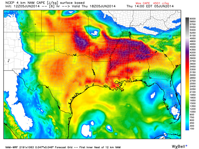
Where are thunderstorms most likely to occur? With Convective Available Potential Energy (CAPE) values at a very high 4,300 J/kg, eastern Oklahoma, the southern half of Tennessee, and northern Alabama and Mississippi look like trouble spots.
In convective seasons of yore, pilots were advised to check three big weather products for the best preflight advice concerning the location and intensity of any anticipated thunderstorms. The big three were: the Convective Outlook (AC), the K-Index, and the Lifted Index. The Convective Outlook has survived, and remains a great source for getting a general idea of where the worst convection will be over the coming three days. It’s produced by the National Weather Service’s Storm Prediction Center (SPC), and can be called up under Convection on the Aviation Weather Center (AWC) website’s Forecasts drop-down menu.
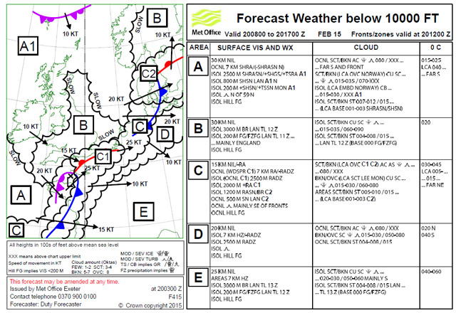
The United Kingdom’s pictorial version of forecast aviation weather improves on our Area Forecasts. Each zone is posted with plenty of information in an easy-to-interpret format.
The dreaded polar vortex
For the past few years it seems all we ever hear about is the “polar vortex.” It’s the cause of every violent thunderstorm, epic snowstorm, hurricane, typhoon, landslide, drought, flood, heat wave, cold spell, tsunami, or any other natural disaster. It’s in vogue, and any television weather forecast is incomplete without a reference to this new menace. As a weather-savvy pilot, your nonflying peers expect you to explain this mysterious vortex in social situations. What will you tell them?
First off, the polar vortex has been around forever! There’s nothing new about it. It was first identified by meteorologist Carl-Gustav Rossby in 1939. The vortex flows around a mass of polar air that’s centered on the north—and south—poles. It has lobes of low pressure troughs at the peripheries, and these show up clearly on hemispheric views of upper-level pressure patterns. Most of the nastier surface lows are triggered by the dynamics associated with the strong jet streams that form the periphery of the polar vortex.
Depending on your location, it’s the position of those slowly undulating jet stream winds that dictate the weather—calamitous or otherwise. Poleward of them, expect colder temperatures, lower humidities, and clearer skies. South of them, it’s warmer, more humid, and cloudier. And where the two air masses collide, expect battles of the air masses. Battles that cause surface lows and fronts.
When the weather turns unusually cold or warm for a particular region, it’s typically because one of the vortex’s lobes has moved overhead and become stationary. That’s what happened this past winter when parts of the northeast were hit with record low temperatures and record high snowfalls. The vortex can morph into anywhere from two to five lobes, as they continuously circle the Earth. As always, change is the rule. That’s the weather!
Another area forecast
Some pilots are down on Area Forecasts. The information’s too vague, they say, and duplicates what you can find on TAFs. Plus, there are no airmets or sigmets to warn you away from adverse weather. I kept all that in mind one day while doing my habitual compulsive weather-surfing.
I came across the United Kingdom’s aviation weather website. Make up a user name and password, then go on to the page bearing the form F415. Pick a time frame, click on the link, and up pops the U.K.’s version of an Area Forecast. It’s an easy-to-interpret chart divided into zones of differing weather. Each zone has associated blocks of text that delve into surface conditions, cloud coverages, and freezing levels.
I know, I know—the U.K.’s scale is much smaller than that of the United States, so it’s easier to parse. Or is it? What with all that water around it, European weather is notoriously complicated and changeable. But would a U.K.-style approach to Area Forecasts help if it were adopted on this side of the Atlantic? Makes you wonder.
Email [email protected]
But the K and Lifted indexes seem to have gone the way of the dodo—at least in general aviation applications. The K Index is all about lapse rates. You take the difference between the temperatures at 5,000 feet (850 millibars) and 18,000 feet (500 millibars), and then add the difference between the 5,000-foot dew point and the 10,000-foot (700 millibars) dew point depression. The dew point depression is the spread between the dew point and the temperature. A K Index of 24 or higher means potential trouble; above 60, there’s a high convective potential.
The Lifted Index is all about the temperature situation at 18,000 feet, or 500 millibars. Here, you calculate the difference between the actual temperature and the temperature of a hypothetical parcel of air, were it lifted to that altitude. Parcel temperature warmer than the actual temperature? That’s a recipe for instability. Warm air rises if the air surrounding it is cooler. So a Lifted Index of minus 4 to minus 8 (or less) is not good news—the parcel is four to eight degrees warmer than the ambient air, and will keep rising.
The K and Lifted indexes have faded in prominence mainly because of their heavy focus on the sub-18,000-foot bias. And if you ask me, doing the math is a hassle.
So it’s a good thing that the meteorological community has more or less replaced both those indexes with a product called CAPE (Convective Available Potential Energy). The technicalities behind CAPE are pretty arcane, but suffice it to say that CAPE is a measurement of both the heat and moisture levels in the entire depth of the sub-tropopause atmosphere, and as such is a good indicator of instability. CAPE is expressed in joules per kilogram: The higher the joules, the higher the convective “juice.” Here’s the breakdown of the CAPE levels:
• < 1,000 joules per kilogram (J/kg): weak instability
• 1,000 – 2,500 J/kg: moderate instability
• 2,500 – 4,000 J/kg: strong instability
• > 4,000 J/kg: extreme instability
Best of all, CAPE charts are color-coded for easy interpretation, with the lower levels in yellow and the highest levels in shades of red. And while CAPE isn’t on the AWC’s convection page, you can quickly find it on many other websites. For example, see Ohio State’s Twister website and click on Severe Wx at the bottom of the homepage. Penn State’s Short Range Ensemble Forecast website will show you computer model predictions of CAPE; click on “CAPE,” and scroll along the top of the page for forecast times. Be sure to note the forecast date and time stamps (in Zulu time) at the top and bottom of each image. Other websites can give you CAPE, of course, as well as the K and Lifted indexes if you want to compare them with CAPE. But with CAPE, there’s no math involved!
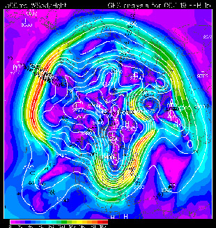
This hemispheric view of the situation at 30,000 feet shows three lobes of one of last winter’s polar vortex events. Notice how the axis of one of the lobes extends southward over the eastern United States. North of the zone of maximum winds, temperatures were much colder. Meanwhile, the western United States experienced comparatively warmer temperatures.


