Skew -T school
Deep down, you know you love ’em

Or be able to identify near-exact freezing levels? Or see where cloud layers and clear air exist? Or see where and what type of precipitation—along with icing conditions (including freezing rain)—could occur? Or see temperature inversions? Or even be able to tell if thunderstorms are likely? Sure, you can learn all these weather conditions by visiting the websites we commonly use in preflight briefings. But those sources mainly rely on textual information or one-dimensional maps.
But by using Skew-T, Log-P charts (“Skew-Ts” for short) you can answer all those questions—and see them in easy-to-interpret plots. Skew-Ts might have earned bad raps from pilots bewildered by their dense network of angled lines and zig-zag plots. Or maybe it’s their use of millibars and Celsius to define altitudes and temperatures, respectively. However, with a little bit of effort the Skew-T’s value becomes quickly apparent—and even intuitive. We’ll go slow here to give you a grounding in Skew-T basics, and neglect for now the hodographs that usually accompany them. (Hodographs show the turning of wind direction with altitude and are used to predict tornados.)
Chart symbology
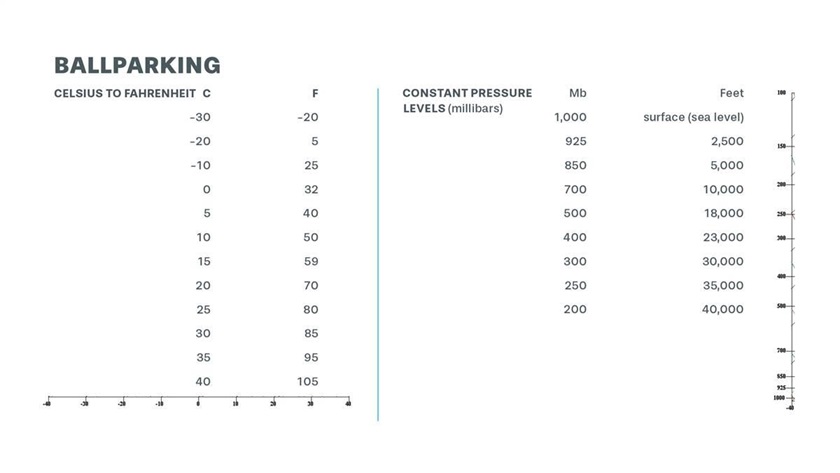
First things first. The chart’s Y-axis (the north-south line) has the scale for altitude, and its X-axis (east-west line) has the scale for temperature. Instead of defining altitude in terms of height above mean sea level, it’s defined with levels of constant pressure—expressed in millibars. And instead of using Fahrenheit for temperature, Celsius is the rule. The lines for temperature are “skewed” in a northeast-southwest direction, hence the chart’s name.
Also, in a northeast-southwest orientation are dashed lines, which represent the saturation mixing ratio—the amount of water vapor in the atmosphere compared to a mass of dry air. Some Skew-Ts don’t show these, but they’re used to determine where dew points and temperatures merge.
Running in northwest-southeast directions are the lines representing the lapse rates. The dry adiabatic lapse rate (DALR—5.5 degrees F/3 degrees C per 1,000 feet of lift) is fairly straight; the moist adiabatic lapse rate (MALR—3.3 degrees F/about 2 degrees C per 1,000 feet of lift) is slightly curved. Over on the right side of some Skew-T charts is another Y-axis that gives wind barbs showing the wind speeds and general directions with altitude.
Click on image for captions


Temperature, dew point, and air parcel traces
Superimposed on this clutter of diagonal lines are the traces for the observed, or environmental, temperature and dew point temperatures. All those lapse rates and ratios are standardized measures—but the temperature and dew point traces are from weather balloons with radiosonde transmitters, temperature profilers, and satellites with remote-sensing equipment. They’re the actual, ambient—or derived, in the case of satellite sensors—conditions at the time of observation. Temperature traces are shown in red, and dew point temperatures are in green or blue. But not all Skew-Ts are alike. Some charts use black lines for both temperature and dew point.
Air parcel temperature lets us compare the temperature of a parcel of air with the temperature of the air surrounding it. What’s an air parcel? Meteorologists use the term to describe a volume of air—think of a large balloon—that’s separate from the general environment and behaves independently. A blob of hot air rising from a parking lot, say, or localized updrafts or clouds. Many Skew-T charts plot parcel lapse rates, so you can compare them with the temperature aloft.
Air parcel analysis becomes very important in determining the chance, and severity, of thunderstorms. We all know that warm air rises—but only if the air around it is cooler. How much cooler? The gap between parcel and observed temperatures tells the tale. A wide gap means a lot of what’s called convective available potential energy (CAPE). CAPE is frequently posted with the chart. Values of 1,000 to 2,500 mean thunderstorms are likely; 2,500-4,000 indicates widespread severe storms; and above 4,000, extreme storms with large hail.
Stable and unstable
Skew-Ts make it easy to see if an air mass is trending unstable, meaning when colder air overlies warmer conditions. A quick glance at the orientation of the temperature trace gives a clue: The farther left the traces, the colder the air aloft. Any warmer air below could rapidly rise through it. If there’s enough moisture, and support from upper-air circulations, then the stage is set for thunderstorms in the warmer months of the year.
If the temperature line is running straight up and down, then you’ve got an isothermal situation. If it’s leaning to the right, there’s an inversion. There won’t be much vertical movement in cases like these. Inversions, for example, suppress cloud buildups because their warmth can exceed the temperature of any rising air from below, preventing it from climbing—unless it has so much energy that it can zoom up through it!
When there’s strong high pressure and fair weather, low-level inversions near the surface are common. In the morning surface temperatures are cool from nighttime radiation but above, say, 1,000 to 2,000 feet agl there’s warm air. As the Earth heats up during the day, you can see the inversion’s S-shaped temperature trace move to the right and watch the inversion disappear—along with its fog, frost, or low cloud levels.
Convective lifting, the ‘loaded gun,’and ‘busting the cap’
Let’s look at a snapshot (right) of how thunderstorm initiation can look on a Skew-T. We can see how the surface temperature and dew points begin to follow their lapse rate profiles, then converge—at about 5,000 feet in our example. Once they’ve merged, condensation occurs, the air becomes saturated, and a cumulus cloud forms. The level at which all this happens is called the “lifted condensation level,” or LCL for short. (An LCL callout—in meters—is often posted, sparing you the work of finding it yourself.)
Now this moist parcel of air rises, following the moist adiabatic lapse rate. But it must overcome the inhibiting force within any inversion—early morning or otherwise. Small wonder that this type of Skew-T profile is called a “loaded gun.” There’s a lot of potential energy building within our raring-to-go parcel.
If it succeeds in popping out the top of the inversion—“busting the cap,” in weather slang—and into colder air, our parcel is free to climb as it morphs into cumulonimbus clouds. It’s reached the “level of free convection,” or LFC in meteo-speak. A convective sigmet could soon be in the offing. Callouts for LFCs—yep, in meters—are also common.
click on image for captions


 Skew-T sources
If you’ve made it this far, I think it’s safe to assume you have true weather-geek tendencies. Welcome to the club. The next step is to check out some Skew-Ts on your own. The National Weather Service releases weather balloons at 81 stations twice a day (00 and 12Z). The balloons take about two hours before they reach their maximum altitude of 115,000 feet, at which point they break and fall to Earth. You can see their soundings at weather.uwyo.edu/upperair/sounding.html or spc.noaa.gov/exper/soundings. However, several weather websites let you click on any point, then call up future Skew-Ts. Pivotal Weather’s GFS models (home.pivotalweather.com) can show Skew-Ts 384 hours into the future. Tropical Tidbits (tropicaltidbits.com/analysis/models), and TwisterData (twisterdata.com) also provide future Skew-Ts with a mouse-click, as do others. There’s even a Skew-T app—SkewTLogPro—that lets you view current and future Skew-Ts along your route of flight.
That’s a lot of Skew-Ts, but if it’s not enough to quench your inner geek, rest assured that there’s plenty more to them than the relatively breezy review I’ve portrayed here. Still, knowing these basics puts you ahead of most pilots. You never know—being able to scope out a Skew-T Log-P chart may come in handy someday, and can’t help but boost your overall weather savvy.